Table of contents
- ThemeData
- Components
- Buttons
- Example Of Elevated Button
- Example Of Outlined Button
- Example Of Text Button
- FloatingActionButton
- Example Of Floating Action Button
- Small Floating Action Button
- Large Floating Action Button
- IconButton
- Example Of Filled Icon Button
- Example Of Filled Tonal Icon Button
- Example Of Outlined Icon Button
- Card
- Example Of Elevated Card
- Example Of Filled Card
- Example Of Outlined Card
- Chips
- Dialog
- Example
- AppBar
- Example
- Color
When Material Design 3 introduces there are a few changes to code levels you have to make to reflect in the UI.
In this article, we will learn how to use Material 3 in the Flutter project with the new material design that Google is developing. As we all know, Flutter 3.3 is out now and supports the latest Material 3 design by Google.
ThemeData
As part of the migration to Material Design 3, a new useMaterial3 flag to ThemeData will allow applications to opt-in to Material Design 3 changes that are coming to many of the components across the library.
No components are currently affected, but as we transfer each component to Material Design 3, they will use this flag to determine which defaults they should use.
class MyApp extends StatelessWidget {
 const MyApp({Key? key}) : super(key: key);

 // This widget is the source of your application.
 @override
 Widget build(BuildContext context) {
   return MaterialApp(
     title: 'Flutter Sample',
     theme: ThemeData(
       useMaterial3: true,
       primarySwatch: Colors.blue,
     ),
     home: const MyHomePage(title: 'Flutter Sample Home Page'),
   );
 }
}
Components
The following Flutter components have been updated to Material Design 3 colors, text styles and shapes generated from the Material Design 3 token database:
Buttons
The common buttons (ElevatedButton, TextButton, and OutlineButton) need to be modified to the most recent design specification as part of the transition to Material Design 3.
Color: Dynamic color compatibility and new color mappings. Now, labels and icons have the same hue.
Icons: 18dp is the new standard size for leading and trailing icons.
Shape: New minimum width, greater height, and fully rounded corner radius
Typeface: The button text is in sentence case; there are no ALL CAPS.
Types: The term “contained button” has been replaced by the terms “elevated button,” “filled button,” and “filled tonal button.”

Image Source: m3.material.io
Example Of Elevated Button
Elevated Button
ElevatedButton(
child: const Text('Enabled Button'),
onPressed: () {
debugPrint("Elevated button clicked")
},
)
Example Of Outlined Button
OutlinedButton(
 onPressed: () {
   debugPrint('Received click');
 },
 child: const Text('Outlined Button'),
)
Example Of Text Button
Text Button
TextButton(
 style: ButtonStyle(
   foregroundColor: MaterialStateProperty.resolveWith<Color?>(
         (Set<MaterialState> states) {
       if (states.contains(MaterialState.selected)) {
         return Colors.white;
       }
       return null; // defer to the defaults
     },
   ),
   backgroundColor: MaterialStateProperty.resolveWith<Color?>(
         (Set<MaterialState> states) {
       if (states.contains(MaterialState.selected)) {
         return Colors.indigo;
       }
       return null; // defer to the defaults
     },
   ),
 ),
 onPressed: () {
  // TODO: handle Text Button
 },
 child: const Text('Text Button'),
)
FloatingActionButton
On a screen, the FAB symbolizes the most significant activity. It makes important acts possible.
The floating action buttons in Flutter come in three sizes: FAB, small FAB, and large FAB.

Example Of Floating Action Button
FloatingActionButton(
 onPressed: () {
   // Add your onPressed code here!
 },
 child: const Icon(Icons.add),
)
Small Floating Action Button
FloatingActionButton.small(
 onPressed: () {
   // Add your onPressed code here!
 },
 child: const Icon(Icons.add),
)
Large Floating Action Button
FloatingActionButton.extended(
 onPressed: () {
   // Add your onPressed code here!
 },
 label: const Text('Add'),
 icon: const Icon(Icons.add),
)
IconButton
As part of the Material Design 3 specification there are updates to the Icon button’s visuals as optional support for toggle states, as well:
![]()
Image Source : m3.material.io
The updated IconButton will appear like the common buttons(TextButton, OutlinedButton etc) without text.
Example Of Filled Icon Button
IconButton(
   icon: const Icon(Icons.filter_drama),
   onPressed: onPressed,
   style: IconButton.styleFrom(
     foregroundColor: colors.onPrimary,
     backgroundColor: colors.primary,
     disabledBackgroundColor: colors.onSurface.withOpacity(0.12),
     hoverColor: colors.onPrimary.withOpacity(0.08),
     focusColor: colors.onPrimary.withOpacity(0.12),
     highlightColor: colors.onPrimary.withOpacity(0.12),
   ))
Example Of Filled Tonal Icon Button
Filled Tonal Icon Button
IconButton(
 icon: const Icon(Icons.filter_drama),
 onPressed: onPressed,
 style: IconButton.styleFrom(
   foregroundColor: colors.onSecondaryContainer,
   backgroundColor: colors.secondaryContainer,
   disabledBackgroundColor: colors.onSurface.withOpacity(0.12),
   hoverColor: colors.onSecondaryContainer.withOpacity(0.08),
   focusColor: colors.onSecondaryContainer.withOpacity(0.12),
   highlightColor: colors.onSecondaryContainer.withOpacity(0.12),
 ),
)
Example Of Outlined Icon Button
Outlined Icon Button
IconButton(
 icon: const Icon(Icons.filter_drama),
 onPressed: onPressed,
 style: IconButton.styleFrom(
   focusColor: colors.onSurfaceVariant.withOpacity(0.12),
   highlightColor: colors.onSurface.withOpacity(0.12),
   side: onPressed == null
       ? BorderSide(
           color: Theme.of(context)
               .colorScheme
               .onSurface
               .withOpacity(0.12))
       : BorderSide(color: colors.outline),
 ).copyWith(
   foregroundColor: MaterialStateProperty.resolveWith(
       (Set states) {
     if (states.contains(MaterialState.pressed)) {
       return colors.onSurface;
     }
     return null;
   }),
 ),
)
Card
Card Widget in Flutter come in three different variations: elevated, filled, and outlined.
A card is identifiable as a single, contained unit, can hold anything from images to headlines, supporting text, buttons, lists, and other components.

Image Source: m3.material.io
Color: Compatibility with dynamic color and new color mappings
Elevation: Lower elevation by default, with no shadow
Three different forms of official cards: raised, filled, and outlined
Example Of Elevated Card
Card(
    child: SizedBox(
      width: 300,
      height: 100,
      child: Center(child: Text('Elevated Card')),
    ),
)
Example Of Filled Card
Filled Card
Card(
 elevation: 0,
 color: Theme.of(context).colorScheme.surfaceVariant,
 child: const SizedBox(
   width: 300,
   height: 100,
   child: Center(child: Text('Filled Card')),
 ),
)
Example Of Outlined Card
Card(
 elevation: 0,
 shape: RoundedRectangleBorder(
   side: BorderSide(
     color: Theme.of(context).colorScheme.outline,
   ),
   borderRadius: const BorderRadius.all(Radius.circular(12)),
 ),
 child: const SizedBox(
   width: 300,
   height: 100,
   child: Center(child: Text('Outlined Card')),
 ),
)
Chips
In contrast to buttons, which are persistent, chips indicate possibilities in a given environment.
Four different chip types exist: assist, filter, input, and suggestion

Image Source: m3.material.io
- Color: Compatibility with dynamic color and new color mappings
- Shape: Rectangle with corners
- Types: Assist chips and suggestion chips are two different categories of action chips. Currently, a subset of choice chips are filter chips.
Chip(
 avatar: const CircleAvatar(child: Text('FA')),
 label: const Text('Flutter Agency'),
 onDeleted: () {
// TODO: handle delete action
 },
)
Dialog
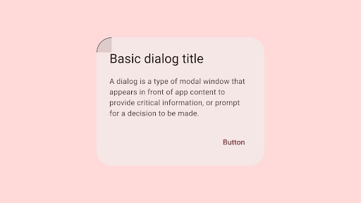
Dialogs can convey information, demand a response, or guide users through a process. Basic and full-screen dialogues are the two different varieties.

Image Source : m3.material.io
Color: Compatibility with dynamic color and new color mappings.
Layout: Greater padding utilized for increased corner-radius and title size
Position: Option for custom basic dialog positioning.
Shape: Increased corner-radius
Typography: Larger and darker headline
Example
OutlinedButton(
 onPressed: () {
   Navigator.of(context).restorablePush(_dialogBuilder);
 },
 child: const Text('Open Dialog'),
)


static Route _dialogBuilder(
   BuildContext context, Object? arguments) {
 return DialogRoute(
   context: context,
   builder: (BuildContext context) {
     return AlertDialog(
       title: const Text('Basic dialog title'),
       content: const Text(
           'A dialog is a kind of modal window that\n'
               'views in front of app content to\n'
               'provide critical information, or prompt\n'
               'for a decision to be made.'),
       actions: [
         TextButton(
           style: TextButton.styleFrom(
             textStyle: Theme.of(context).textTheme.labelLarge,
           ),
           child: const Text('Disable'),
           onPressed: () {
             Navigator.of(context).pop();
           },
         ),
         TextButton(
           style: TextButton.styleFrom(
             textStyle: Theme.of(context).textTheme.labelLarge,
           ),
           child: const Text('Enable'),
           onPressed: () {
             Navigator.of(context).pop();
           },
         ),
       ],
     );
   },
 );
}
Also, Read This Post:
AppBar

Image Source: m3.material.io
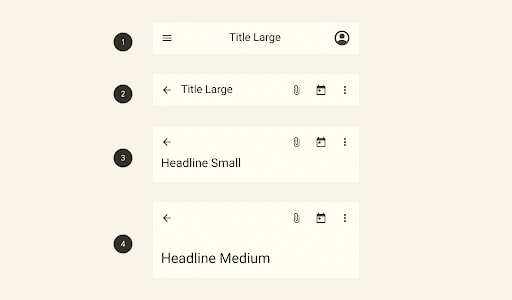
Color: Color: Compatibility with dynamic color and new color mappings
Elevation: A color fill rather than a drop shadow establishes separation from the content.
Typography: Larger default text
Layout: Larger default height
Types: There are currently four sizes for top app bars: small, medium, and large.
Example
Scaffold(
 appBar: AppBar(
   actions: [
     TextButton(
       style: style,
       onPressed: () {},
       child: const Text('Action 1'),
     ),
     TextButton(
       style: style,
       onPressed: () {},
       child: const Text('Action 2'),
     ),
   ],
 ),
);


MaterialApp(
 theme: ThemeData(
     useMaterial3: true,
     colorSchemeSeed: const Color(0xff6750A4)
 ),
 home: Material(
   child: CustomScrollView(
     slivers: [
       SliverAppBar.large(
         leading: IconButton(icon: Icon(Icons.menu), onPressed: () {}),
         title: const Text('Large App Bar'),
         actions: [
           IconButton(icon: const Icon(Icons.more_vert), onPressed: () {}),
         ],
       ),
       // Just some content much enough to have unique object to scroll.
       SliverToBoxAdapter(
         child: Card(
           child: SizedBox(
             height: 1200,
             child: Padding(
               padding: const EdgeInsets.fromLTRB(8, 100, 8, 100),
               child: Text(
                 'Here be scrolling content...',
                 style: Theme.of(context).textTheme.headlineSmall,
               ),
             ),
           ),
         ),
       ),
     ],
   ),
 ),
)
Also, Read This Post:
Color
ColorScheme
Comes with an updated/expanded color scheme to grant more flexibility.
There are two deprecated colors for ColorScheme: primaryVariant and secondaryVariant. They need to be removed from the 5 constructors and the copyWith method. I then map references of these properties to primaryContainer and secondaryContainer.
As part of the migration to Material Design 3, this PR adds new APIs to make it easy to generate new Material Design 3 ColorSchemes from just a single color.
The new APIs are as follows:
ColorScheme.fromSeed()
You can construct a complete Material Design 3 ColorScheme derived from the tones of a single seed color with:
final lightScheme = ColorScheme.fromSeed(seedColor: Colors.green);
final darkScheme = ColorScheme.fromSeed(seedColor: Colors.green, brightness: Brightness.dark);
Typography / Iconography
Material Design 3 comes with an updated/expanded typography scale to allow for more flexibility. We will be updating the text theme to support Renaming existing text styles so they are grouped into 5 categories with small, medium, large size and Add a new Typography constructor that provides updated default values for each text style for Material Design 3.
Conclusion
A whole ColorScheme no longer needs to be explicitly created, and the dynamic color is naturally supported on devices; Material Design 3 is a little simpler. You’ll like being able to use actual brand color in the app theme design now that you can. By combining Material 3 with the Flutter application, you can build consistent and unified UI experiences across web, desktop, and mobile platforms.
The Flutter developers have been putting a lot of effort into giving Flutter complete Material 3 functionality. As seen above, you can already move your current Material 2 app to Material 3. You can follow the app development of Flutter widgets that don’t yet have Material 3 support if you use them. Moreover, if you are looking for dedicated developers who can work on your project, you can hire flutter developer for the hourly-based model or fixed projects. We are delighted to help you.
Frequently Asked Questions (FAQs)
1. What is Material Design in Flutter development?
Material design in Flutter is an adaptable design system. Hence, with the help of the Material design system, we can develop the Flutter widgets.
2. How can I access material 3 in the Flutter framework?
To enable Material 3, first, define the theme of ThemeData in the MaterialApp class and will set its useMaterail3 property to true. By using this functionality, you select Use Material 3.
3. Why is the MaterialApp class used in Flutter?
MaterialAppclass is the predefined class and the core component of Flutter. It accesses all the other components and widgets which Flutter SDK gives.
