How to Use Draggable and DragTarget to Create Drag and Drop UI Elements in Flutter?
Flutter is a mobile app SDK that allows developers to build and publish cross-platform apps for Android and iOS. One of the most valuable features of Flutter is its ability to create draggable U.I. elements. With this feature, you can create buttons, lists and even entire screens that can be dragged around your app.
A Draggable widget lets you add drag-and-drop behavior to any widget. DragTarget is a widget that enables you to specify which widget should accept the drop event when the user drops the dragged object.
In this article, we’ll talk about drag and drop, Draggable and DragTarget widgets, which are part of the Flutter Toolkit library.
About Drag and Drop UI elements
Drag and Drop UI elements are a new Flutter widget that allows you to create powerful custom interactions. You can use Drag and Drop UI elements to build your app’s core interactions, such as dragging an object from one location in your app onto another location.
Flutter’s DragTarget widget lets you define some target areas on a page where drag events will be allowed. For example, if the user drags an image over a button, that button might be set up as a target for drag events (e.g., it can receive drops). When dragged items hit targets, they’ll bounce off them and fall back down into place with gravity according to their angle of entry into the target area.
Draggable UI Elements
The Draggable widget can create a draggable element in your app. Drag and drop functionality is a popular feature that allows you to drag an object from one part of the screen and drop it into another. This is useful for rearranging items, moving files around, and many other things.
The most prominent use of draggable interfaces is in web design. Many websites allow users to rearrange elements on their pages through this feature. In addition to being used on websites, draggable can be used in many other areas, such as mobile apps, desktop software, and even video games!
Also, Read This Post:
The Upcoming Trends in Cross-platform Desktop App Development in 2023
DragTarget Element
DragTarget is a widget that allows you to specify a region of an app where a drag action can be started. DragTarget is a subclass of GestureDetector, and you can use it to detect drag actions or gestures in your app.
DragTarget has three methods:
onStart – called when the user starts dragging
onDrag – called when the user drags their finger over the target area
onEnd – called when the user stops dragging.
Using these widgets, you can allow an entire widget to drag or just a part of it!
There are two widgets that make it possible to drag and drop U.I. elements in Flutter: Draggable and DragTarget. Draggable allows you to drag an entire widget or part of it (e.g., its background). DragTarget is used when multiple elements respond to the same event (e.g., responding with different animations).
The Draggable and DragTarget widgets are the first step in allowing users to interact with your app. These widgets enable you to create a drag-and-drop experience for moving items around the screen, including moving and resizing U.I. elements or entire pages.
When creating a drag-and-drop experience in Flutter app development, it is possible to use the Draggable widget. The Draggable widget allows you to drag objects around your screen.
To implement a drag-and-drop experience, you need to use one or more Draggable widgets and at least one DragTarget widget. The DragTarget widget can be any shape or size as long as it has a valid drop target for the Draggable widget.
These widgets can handle native element dragging and customize your draggable widget using a custom image instead of the default background color.
You can combine these for powerful custom interactions. For example, if you want a user to be able to drag an image over a button, or drag an entire widget from one place in your app to another, then Draggable and DragTarget are the first steps in allowing them to do so.
Example
Drag and drop is a common interaction that is used in many apps. It is an easy way to perform different tasks and can be used for a variety of purposes. For example, you can drag files into an email or move them around on your phone.
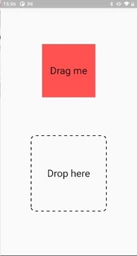
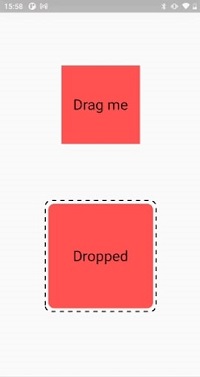
In this example, we will discuss the initial steps required to create a simple drag-and-drop UI element. The elements can be dragged around to the desired location, and they can also be dropped onto other elements.
The first step is to create a Draggable widget. This widget will define the position of our element as well as its bounds. To make your widget draggable, you need to give it two children: a Text widget and a boxed text widget. The text will display in the box when it is being dragged around. The box will contain all the necessary information about where to drop your element.
The second step is to create a DragTarget widget that allows you to specify which other widgets are eligible for dropping an element onto them. You can also set custom properties on your DragTarget instance if you want any special functionality when your element is being dropped onto another one (such as changing colors or hiding/showing something).
Example
main.dart
import 'package:flutter/material.dart';
import 'package:dotted_border/dotted_border.dart';
const Color darkBlue = Color.fromARGB(255, 18, 32, 47);
void main() {
runApp(const MyApp());
}
class MyApp extends StatelessWidget {
const MyApp({Key? key}) : super(key: key);
@override
Widget build(BuildContext context) {
return const MaterialApp(
debugShowCheckedModeBanner: false, home: DemoExample());
}
}
class DemoExample extends StatefulWidget {
const DemoExample({Key? key}) : super(key: key);
@override
State<demoexample> createState() => _DemoExampleState();
}
class _DemoExampleState extends State<demoexample> {
@override
Widget build(BuildContext context) {
bool isDropped = false;
String _color = "red";
return Scaffold(
body: Center(
child: Column(
mainAxisAlignment: MainAxisAlignment.center,
children: [
LongPressDraggable<string>(
// Data is the value this Draggable stores.
data: _color,
feedback: Material(
child: Container(
height: 170.0,
width: 170.0,
decoration: const BoxDecoration(
color: Colors.redAccent,
),
child: const Center(
child: Text(
'Dragging',
textScaleFactor: 2,
),
),
),
),
childWhenDragging: Container(
height: 150.0,
width: 150.0,
color: Colors.grey,
child: const Center(
child: Text(
'I was here',
textScaleFactor: 2,
),
),
),
child: Container(
height: 150.0,
width: 150.0,
color: Colors.redAccent,
child: const Center(
child: Text(
'Drag me',
textScaleFactor: 2,
),
),
),
),
SizedBox(
height: MediaQuery.of(context).size.height * 0.15,
),
DragTarget<string>(
builder: (
BuildContext context,
List<dynamic> accepted,
List<dynamic> rejected,
) {
return DottedBorder(
borderType: BorderType.RRect,
radius: const Radius.circular(12),
padding: const EdgeInsets.all(6),
color: Colors.black,
strokeWidth: 2,
dashPattern: const [8],
child: ClipRRect(
borderRadius: const BorderRadius.all(Radius.circular(12)),
child: Container(
height: 200,
width: 200,
color: isDropped ? Colors.redAccent : null,
child: Center(
child: Text(
!isDropped ? 'Drop here' : 'Dropped',
textScaleFactor: 2,
)),
),
),
);
},
onAccept: (data) {
debugPrint('hi $data');
setState(() {
isDropped = true;
});
debugPrint('hi $isDropped');
},
onWillAccept: (data) {
return data == _color;
},
),
],
),
));
}
}
</dynamic></dynamic></string></string></demoexample></demoexample>
Output


Conclusion
This article looks at two new widgets for building drag-and-drop interactions in Flutter app development. These widgets make it easy to construct full-fledged drag-and-drop interfaces in Flutter with just a few lines of code! I hope you guys enjoyed reading this article and have a clear idea about the latest widgets in Flutter. Are you looking for such kind of functionality to develop in your mobile or want to build a mobile app for your need, hire flutter mobile app developer to develop your own high-end mobile apps.

Frequently Asked Questions (FAQs)
1. Does Flutter have a drag-and-drop UI?
Flutter gives you a widget, LongPressDraggable, which provides the exact behaviour you require to start with drag-and-drop interaction. The LongPressDraggable widget will recognise when the long press is fired and will view a new widget nearby the user’s finger. As the user drags, the widget will follow the user’s finger.
2. How do I build the custom dropdown in the Flutter app?
The dropdown button will make the full-screen stack by using the overlay. Add the full-screen gesture detector behind a dropdown so that it is closed when a user taps anywhere on the screen. Hence, the overlay is linked to the button using LayerLink and the CompositedTransformerFollower widget.
3. How do you use DragTarget in Flutter?
DragText < T extends Object > class Null safety. A widget will get the data when the draggable widget is dropped. When the draggable is dragged on top of the drag target, the drag target is asked whether it will accept any data that the draggable is carrying.
4. What are a Draggable widget and a DragTarget widget?
A draggable widget recognises the beginning of the drag gesture and displays the feedback widget that tracks a user’s fingers across the screen. However, if a user moves their finger to the top of DragTraget, that target can accept data carried by a draggable.
The DragTarget widget in Flutter will receive data dragged and dropped by the user. It permits you to drag an item from one widget to another. Hence, it is a widget utilised to create games and other interactive user interfaces.
